


There have been so many great logos in the history of the NHL, but of these 10 classics, which one would you like to see be brought back on a permanent basis?
1. Anaheim Mighty Ducks – Original Duck Mask Logo (1993–2006)
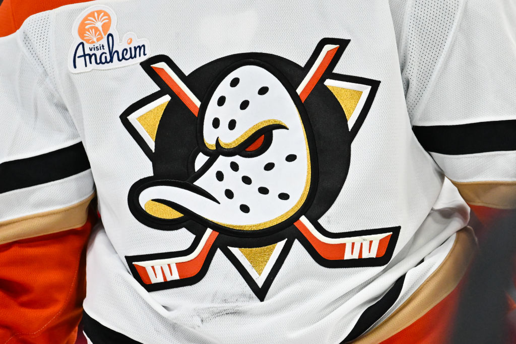
The teal-and-purple mask with crossed sticks is pure ‘90s gold and deeply tied to hockey pop culture.
2. Buffalo Sabres – “Goathead” Logo (1996–2006)
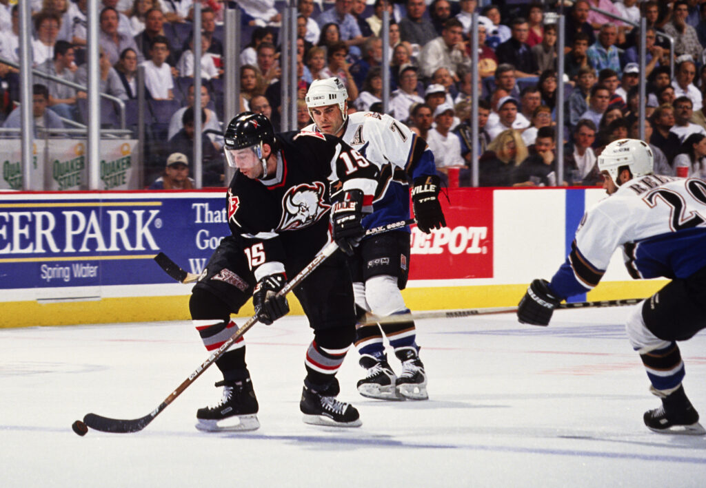
A bold black-and-red redesign that’s gained a cult following—and made a recent comeback in alternate form.
3. Hartford Whalers – Classic “Whale Tail” Logo (1979–1997)
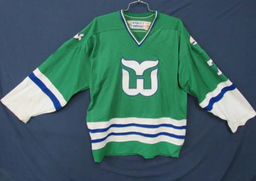
Technically from a defunct team, but one of the smartest logo designs ever. The hidden “H” still wows.
4. Calgary Flames – “Blasty” Flaming Horse Head (1998–2006)
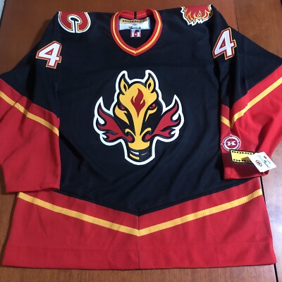
Aggressive, fiery, and a hit with fans—especially in throwback alternates.
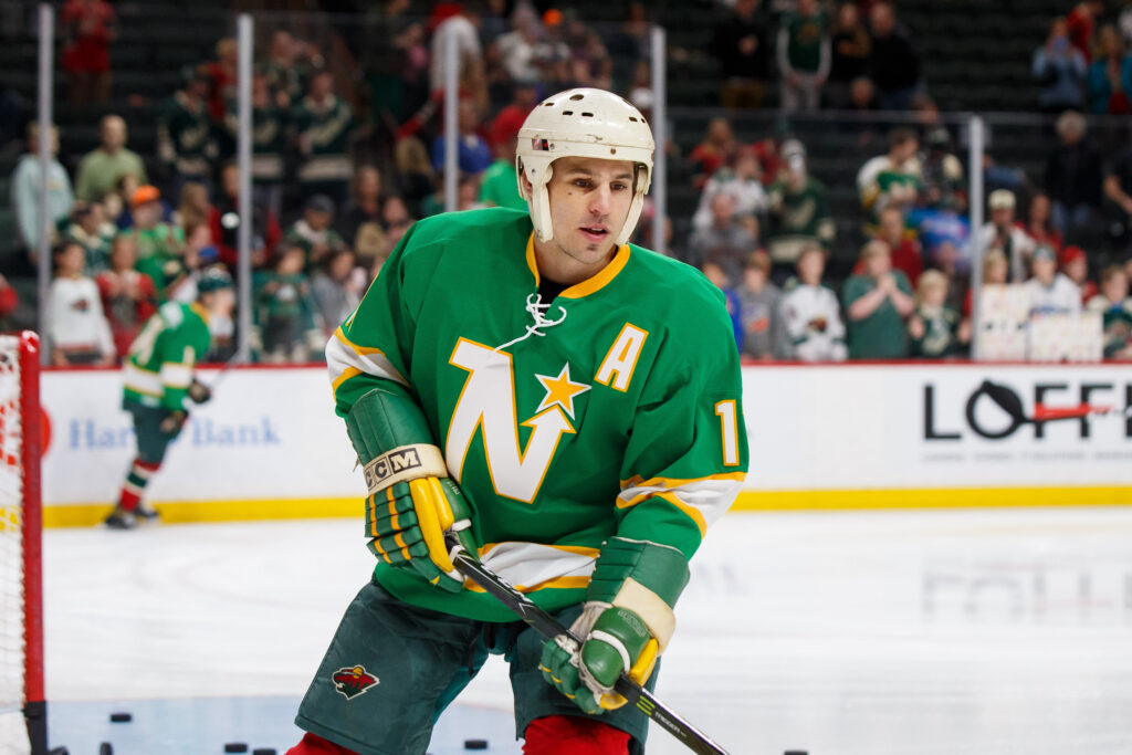
5. Minnesota North Stars – Green & Gold Star Logo (1967–1993)
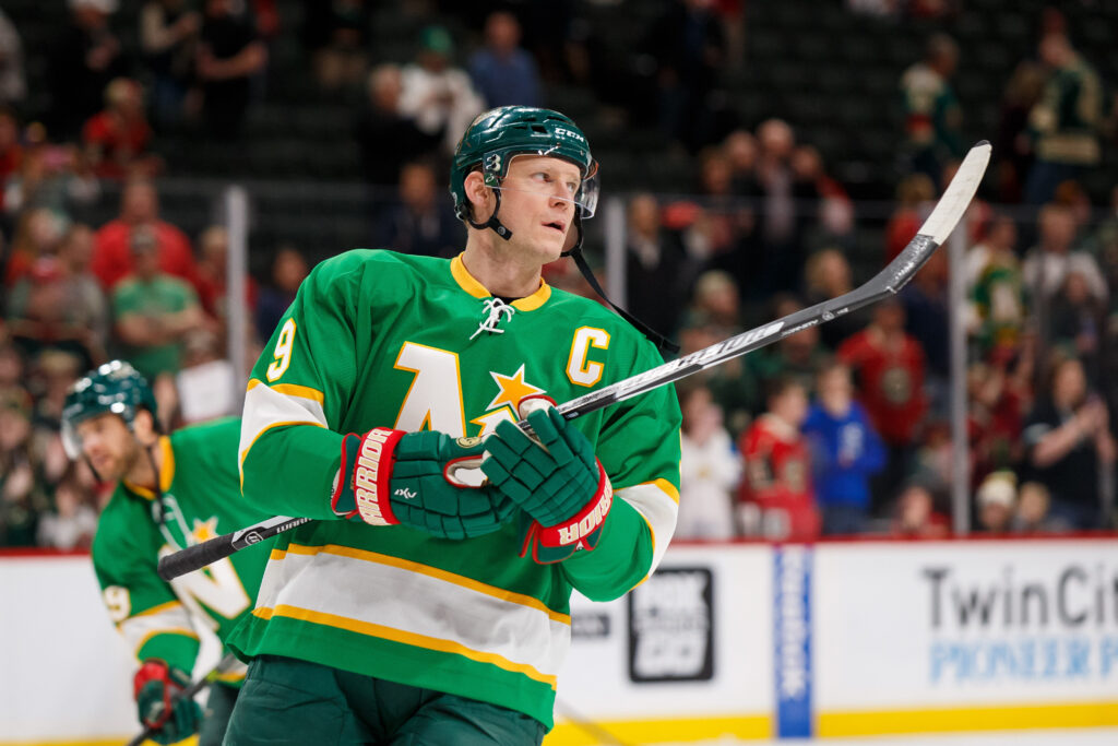
Clean, simple, and still loved by fans in the State of Hockey. The Wild could pay homage more directly.
6. Phoenix Coyotes – Kachina Logo (1996–2003)
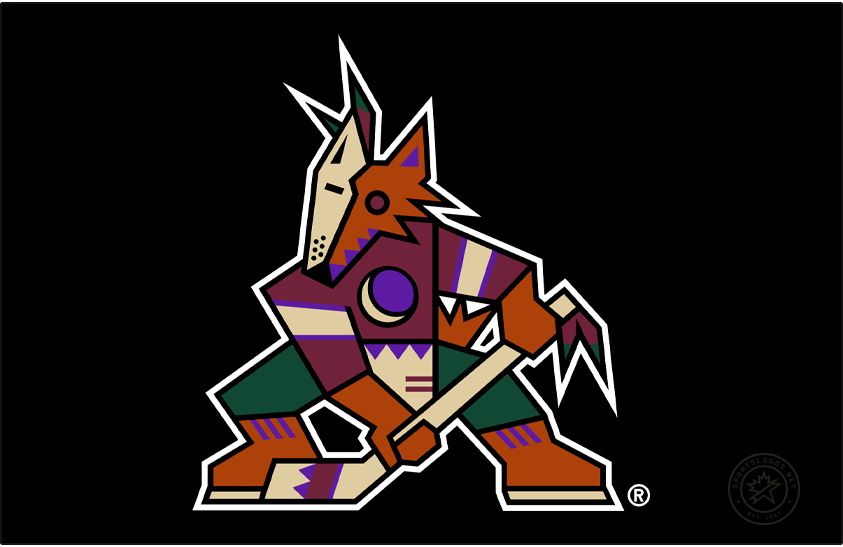
A bold Southwest-inspired design that’s back part-time but deserves a permanent return.
7. Vancouver Canucks – Flying Skate Logo (1978–1997)
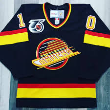
Black, red, and yellow—with serious edge and 90s flair. Always a fan-favorite for throwback nights.
8. New York Islanders – “Fisherman” Logo (1995–1997)
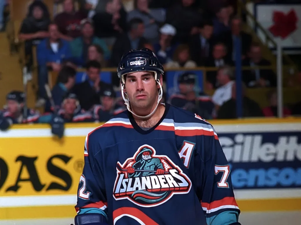
Often mocked at the time, but ironically beloved now. A love-it-or-hate-it masterpiece.
9. Los Angeles Kings – Forum Blue & Gold Crown Logo (1967–1988)
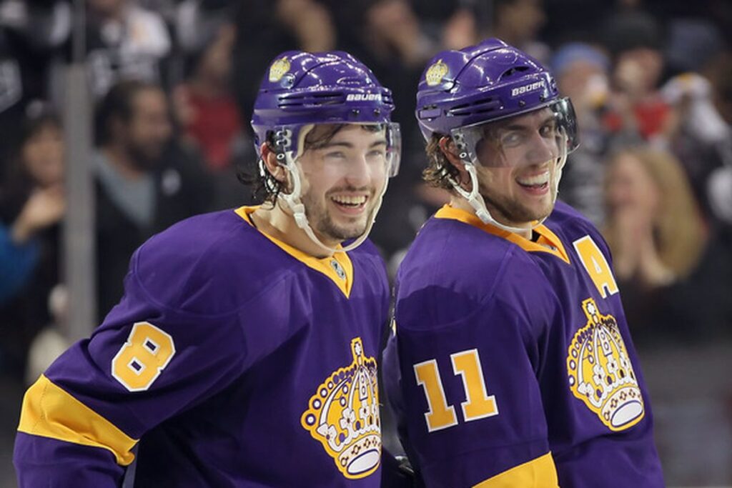
Regal and classic—the purple and gold colorway screams royalty and vintage cool.
10. Colorado Rockies – Mountain “C” Logo (1976–1982)
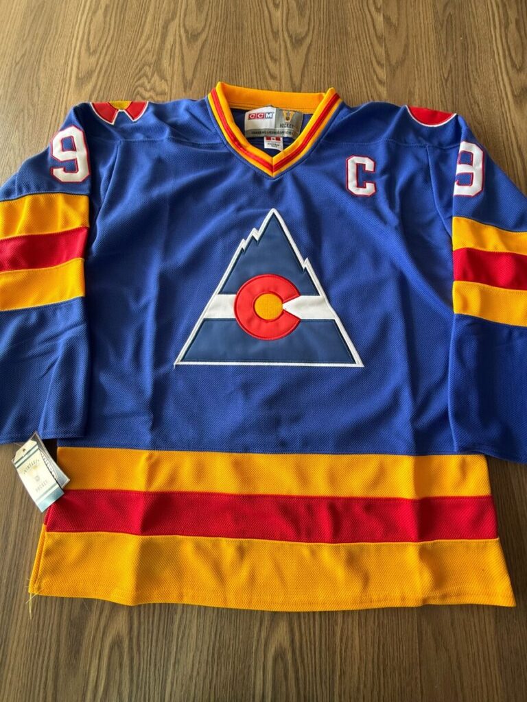
Not to be confused with the MLB team, this was Colorado’s original NHL identity—short-lived but iconic.