


These are the greatest logos in NBA history:
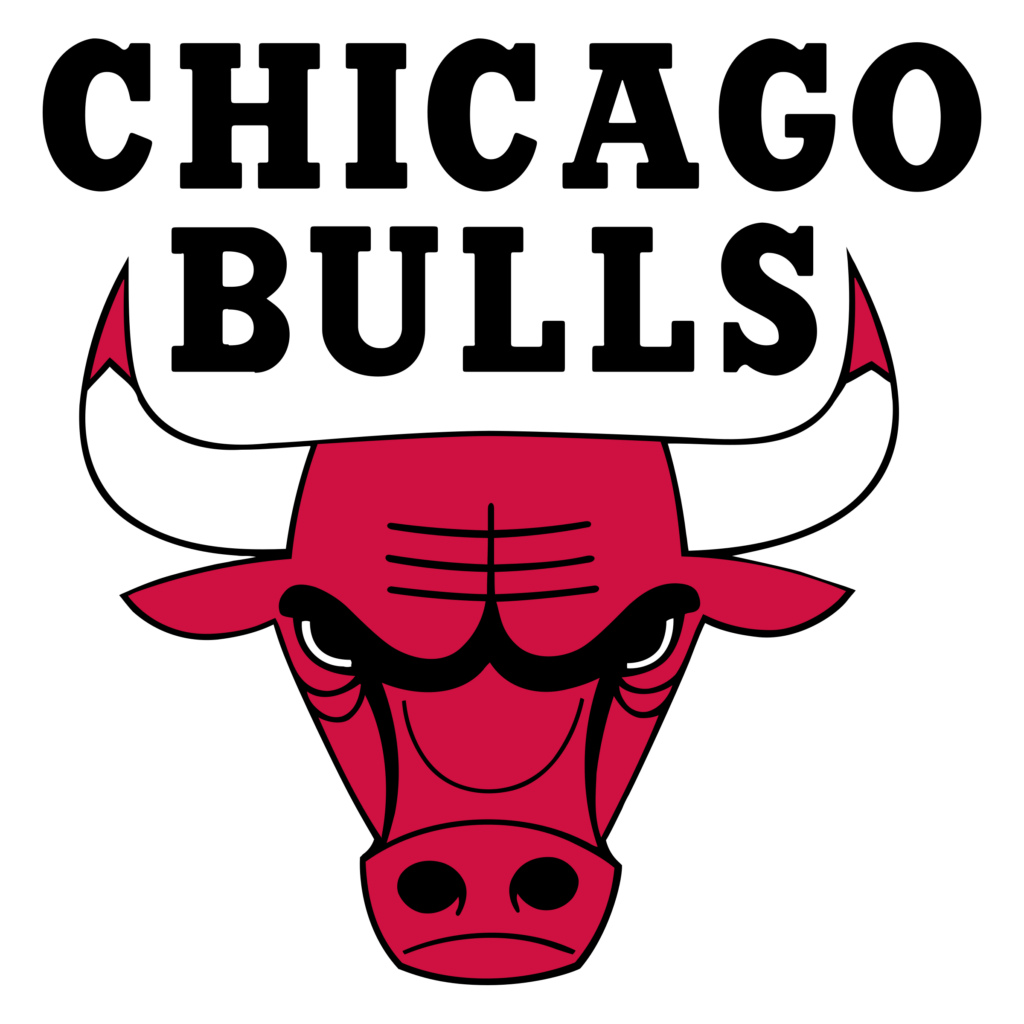
Chicago Bulls (1966-Present)
When you think of basketball, Michael Jordan and the 1990s Chicago Bulls often come to mind. This logo is simple, yet recognizable by both NBA fanatics and non-sports fans.
Toronto Raptors (1995-2008)
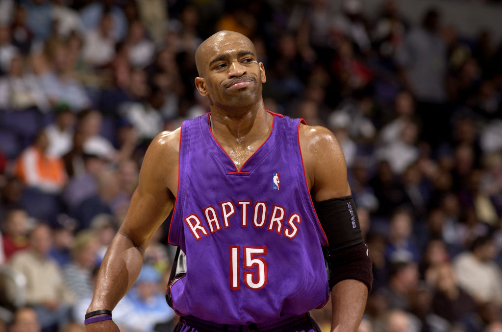
The baby raptor logo is synonymous with when Vince Carter helped basketball grow in Canada. The color scheme is great, and its team representation is unambiguous.
Boston Celtics (1976-1996)
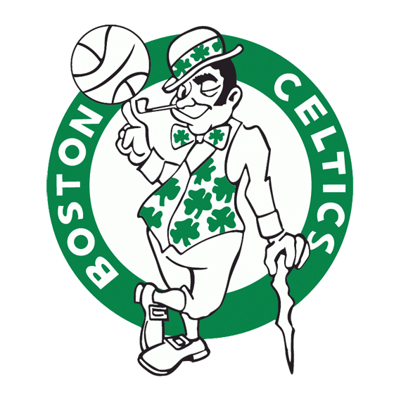
This logo has become iconic in the sports world. It timelessly connects to the Irish American culture in the city of Boston with memorable details, including the leprechaun’s pipe.
Miami Heat (1999-Present)
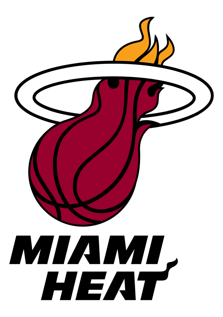
There is a reason why the Heat have never majorly changed their logo. The flaming basketball going into the hoop is simple, but it fits seamlessly on each jersey and court floor.
Detroit Pistons (1996-2001)
This is when I feel that the Pistons logo truly represented Detroit. The color scheme, font, and horse in the background all add to the logo’s reflection of the hardworking Motor City.
Orlando Magic (2000-2010)
When I see this logo, I think of Tracy McGrady averaging 32 points per game. This logo combines the best elements of its predecessor and successor: the font and large stars from the original, and the in-motion basketball that is present today.
Vancouver/Memphis Grizzlies (1995-2004)
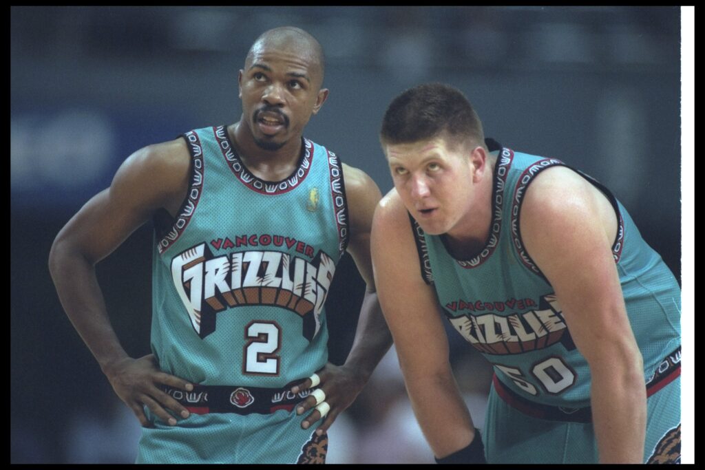
This logo gives a more authentic feel to the mascot of a grizzly bear. I also really appreciate the unique turquoise-lead color scheme.
Los Angeles Lakers (1999-2017)
When it comes to the Lakers, there is no wrong answer as each logo equally represents one of the most storied franchises in sports. From Jerry West to Magic Johnson to Kobe Bryant to LeBron James, the Lakers’ logo deserves credit for its recognizability.
San Antonio Spurs (1989-2002)
This Spurs logo stands out because of its stripes of teal, pink, and yellow. This color scheme does a great job of highlighting the fiesta, which takes place every year in San Antonio.
Minnesota Timberwolves (1996-2008)
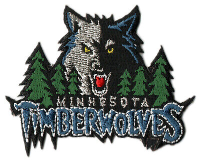
The wolf in this logo is still what I think of when I watch the Timberwolves today. The pine trees and all-caps font make this logo intimidating in a way that I think adds to the essence of competitive sports.
Utah Jazz (1996-2004)
I am very happy that the Jazz’ current rebrand will bring back the team’s 90s aesthetic. The inclusion of Utah’s iconic snowcaps elevates this logo, alongside the beautiful purple/white/blue color scheme.
Houston Rockets (1995-2002)
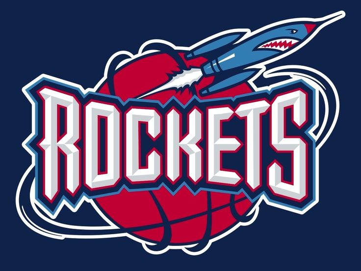
The font for this logo significantly emphasizes the team’s name, and I think it is a nice touch how the rocket exhaust is in a circle surrounding the basketball. When I see this logo, I think of the Rockets’ “Phi Slamma Jamma” era.
Philadelphia 76ers (1997-2009)
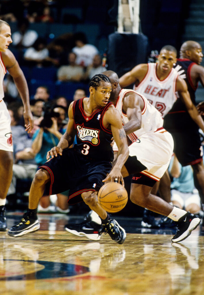
The colors gold and black fit complement the team’s other primary colors of red, white, and blue. I find this logo to be more exciting than the present-day logo, and that it fits better on a jersey or court floor.
Super Sonics (1995-2001)
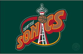
This logo will forever be nostalgic in the eyes of NBA fans. It is simple, yet the Space Needle observation tower in the background provides an element of nuance. The green and yellow color scheme is also one which is unique and memorable.
Cleveland Cavaliers (2010-2017)
This Cavs logo stands out because of its inclusion of the sword. While the ‘03-’10 logo depicts the same sword, I personally appreciate how a yellow outline was added to the design. This logo has the best overall combination of font and color scheme in comparison to its predecessors and successors.
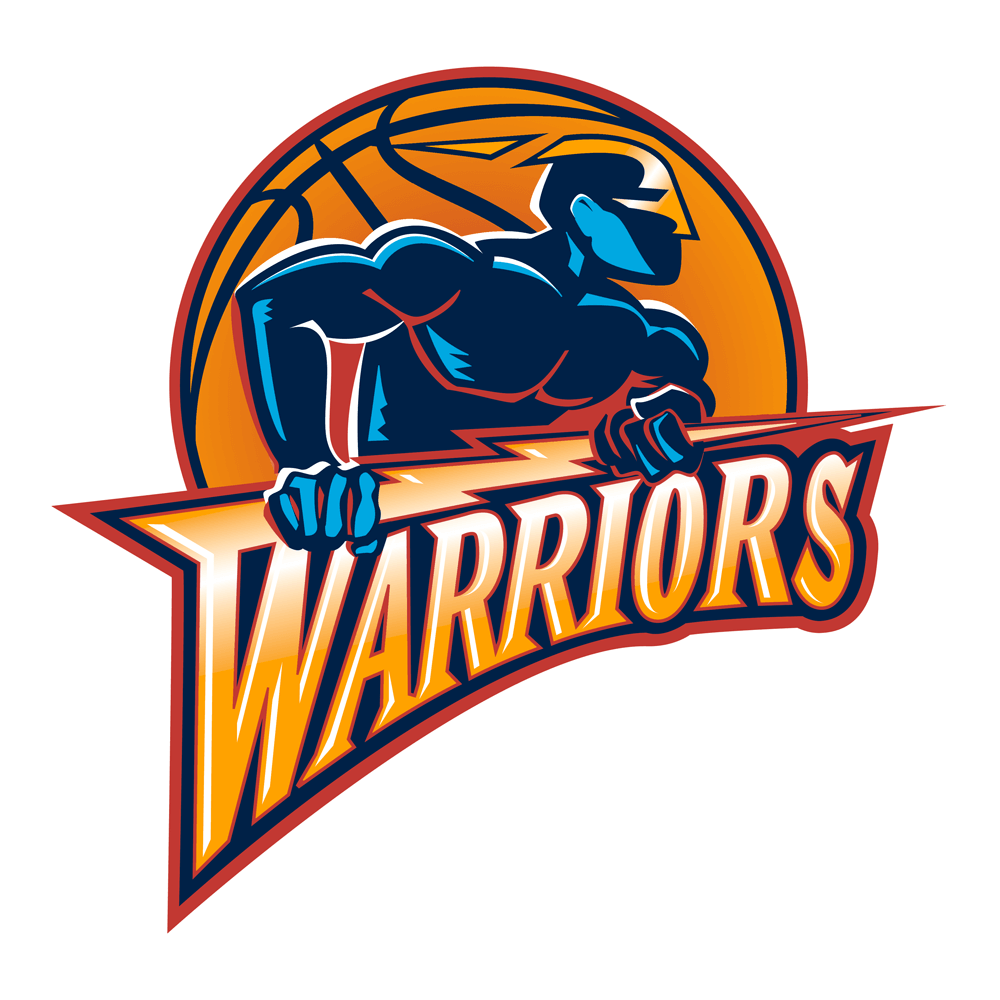
Golden State Warriors (2010-Present)
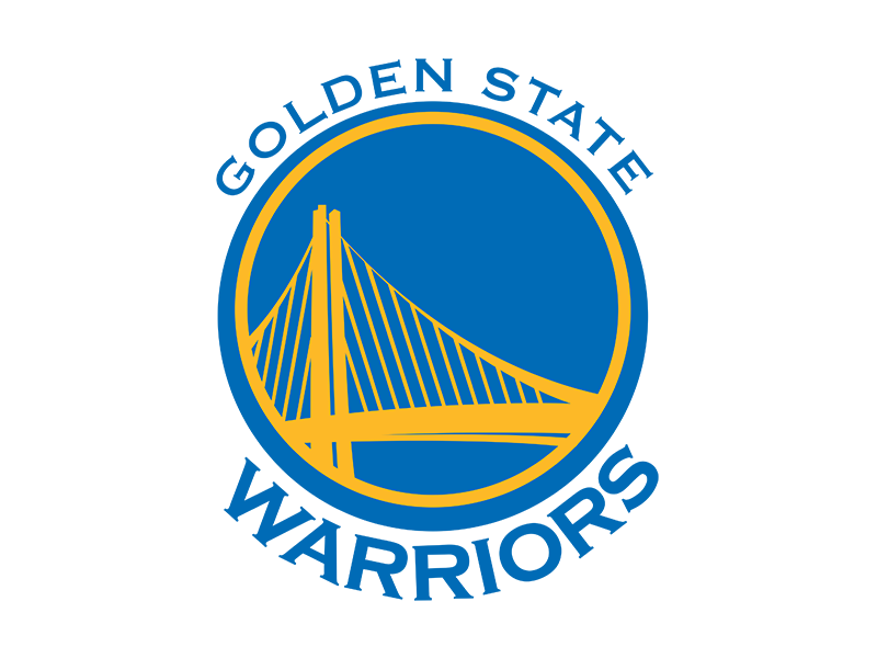
This logo accomplishes everything that a logo should. It is simple, has a recognizable color scheme, and represents the city with the Bay Bridge drawing. When I think of basketball in 2010s, this logo alongside the previously mentioned Cavaliers instantly come to mind.
New York Knicks (1995-2011)
Maybe I am slightly biased because I am a Knicks fan. However, I do think that this logo is extremely recognizable. I like how it includes the city name at the top, unlike the ‘92-’95 logo. I also like how this logo incorporates a slightly darker shade of orange, as well as a darker shade under the letters that make up the team’s name.
Oklahoma City Thunder (2008-Present)
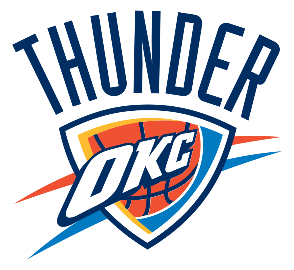
This logo is both incredible and disappointing at the same time. I love how the logo can easily go on various clothing apparel, alongside the strong color scheme. Yet, I wish it placed greater emphasis on actual thunder or lightning.
Atlanta Hawks (1995-2007)
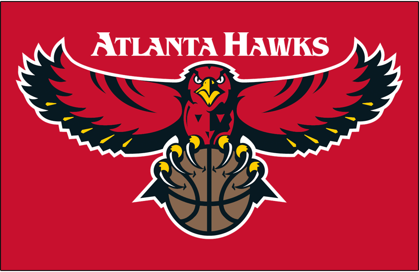
I appreciate logos that underscore the team’s mascot. This logo stands out because of the red hawk. While the current logo is not bad, there is something objectively cool about a hawk clawing a basketball.
Golden State Warriors (1997-2009)
Known for representing the Warriors during their “We Believe” era, this logo showcases a warrior figure carrying a lightning bolt that is connected to the “W” in the team’s name. While this logo does not fit onto jerseys or court floors as seamlessly as the current logo, it deserves credit for its creativity.
Dallas Mavericks (2001-2017)
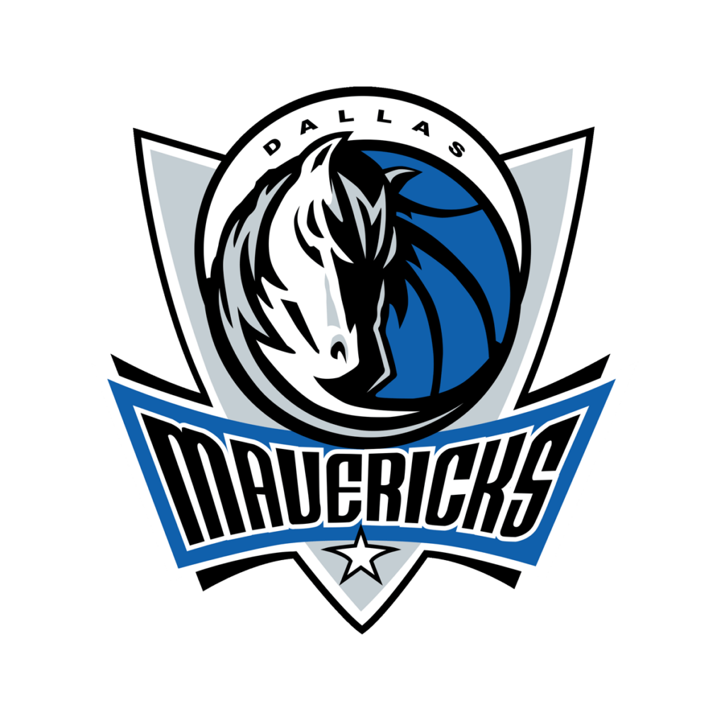
The Maverick horse design on this logo has become very recognizable to the point where all future Mavericks logos will likely include it. I appreciate how when I look at this logo, I can easily see what the city, team name, team colors, and mascot are.
Sacramento Kings 1994-2016
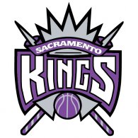
The darker shades of purple and gray give this logo a striking and memorable appearance. While the Kings’ current logo also features a crown, the font and crossed spears in this design feel more authentic and better aligned with the team’s name and identity.
Boston Celtics 1960-1968
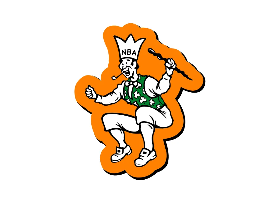
This logo is not necessarily pretty. However, has become iconic since appearing on the television screen of everybody across the country as Bill Russell and the Celtics won eight championships in a row.
Milwaukee Bucks 1968-1993
This is my favorite actual design of all the NBA logos from 1970 or prior. While the buck in this logo does not necessarily convey competitive power, I find it to be both distinctive and nostalgic (the green sweater is pretty cool).
Portland Trailblazers 1997-2009
This logo does all that a sports logo should. It can seamlessly fit on various apparel or a court floor, showcases the team’s colors, and subtly reflects the team’s name by depicting the crisscrossing of two different trails. It makes since why the Trailblazers have not had to rebrand their logo too often throughout their history.